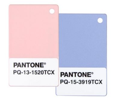
Every year, I report in on what the Pantone has chosen for colour of the year. For some reason, this year is a special one and they have decided to pair two colours together for a winning combination. Let it be known that Rose Quartz (13-1520) and Serenity (15-3919) are this year’s winners.
This year’s colours are soft in nature, reminding us of gender stereotypes, yet according to this video, it’s about the duality and balance of the colours.
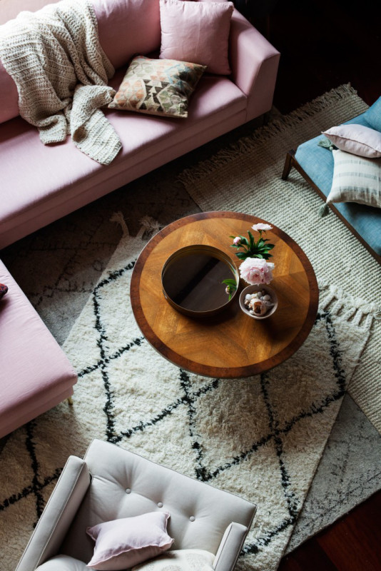
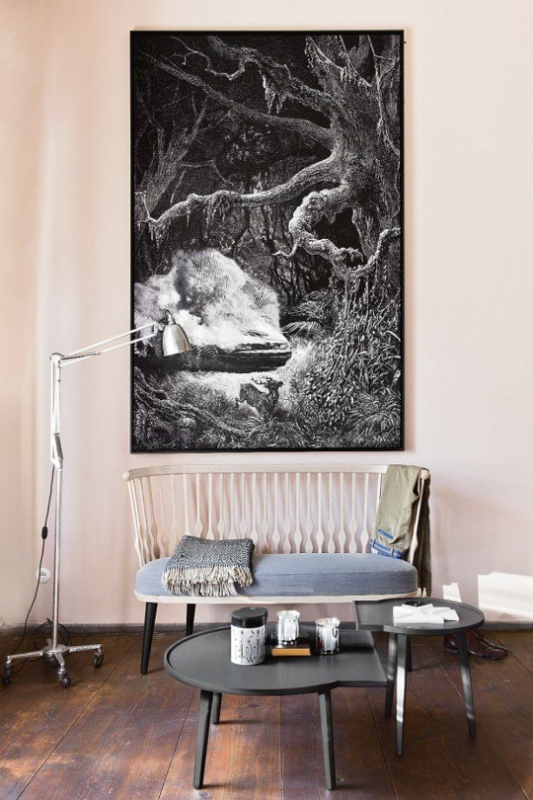
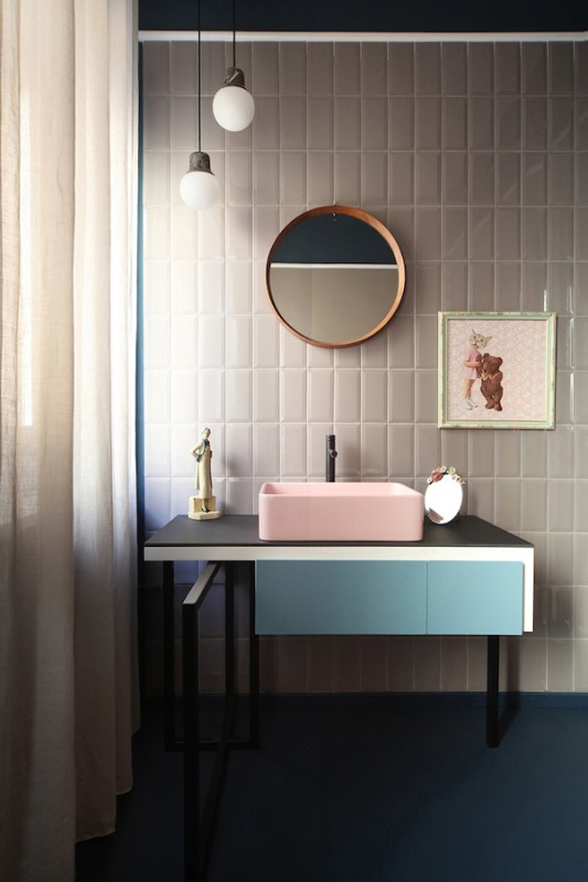
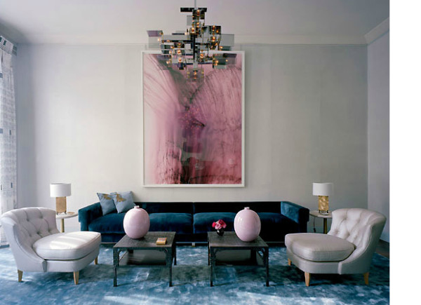
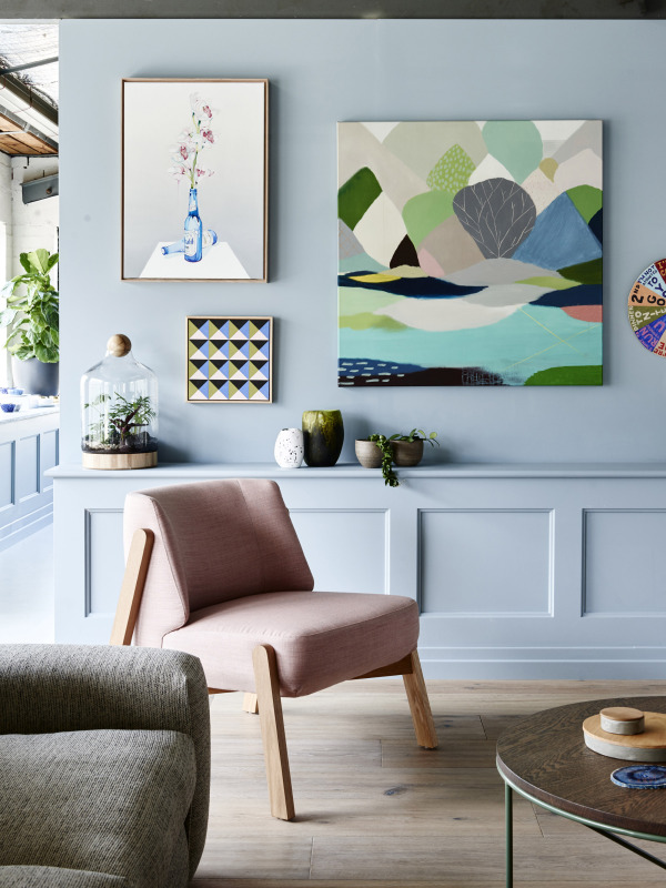
I quite like that this year’s colour combination is vastly different from the previous years (see here for 2014 and 2015’s selections). These colours do bring a sense of calming and are, perhaps, more approachable to the consumer. Soft pinks and blues are often labeled as gender colours (think baby nursery) but I want to show you some examples of how these colours can be used in a neutral way and how stunning they can be.
