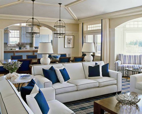
Oatmeal and Navy Blue. It almost sounds nautical, doesn’t it? A bit classic, yet current? The trick with this colour palette is to keep both colours on the warm side. This will help you keep clear of the theme-like nautical look. Instead, lean towards beige that has cream undertones, and blues that have some warm gray in it (this will ensure it’s not purple!). Here is a colour palette I have been working on for a client with these colour tones…

The lovely part about this colour combination is that it will stand the test of time (a.k.a. it’s not a trend!). By steering away from the gray hues and not entering into a colour that is too “hot” right now, this colour duo should keep you and yours happy for years to come. Not only is it classic but it’s also warm and inviting. Try this palette in any space in your house. It will work in any space, no matter how big or small. It’s a winner in my books!
 |
| via |
 |
| via |
