The Reno Projects

  • About
  • My Reno Project(s)
  • Project Spotlight
  • Search By Room
  • Contact

Pantone’s 2016 Colour(s) of the Year

February 9, 2016

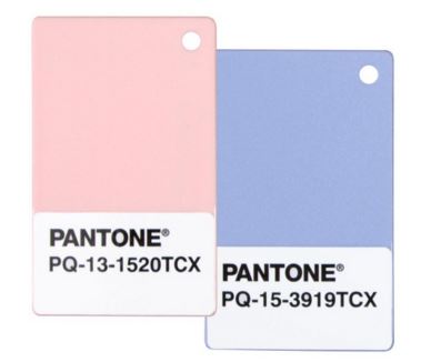
Every year, I report in on what the Pantone has chosen for colour of the year. For some reason, this year is a special one and they have decided to pair two colours together for a winning combination. Let it be known that Rose Quartz (13-1520) and Serenity (15-3919) are this year’s winners.

pantone 2016

via


This year’s colours are soft in nature, reminding us of gender stereotypes, yet according to this video, it’s about the duality and balance of the colours.

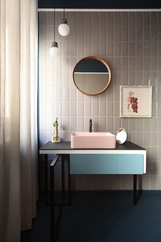
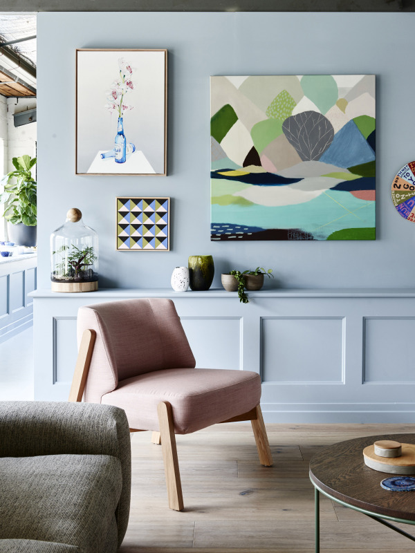
I quite like that this year’s colour combination is vastly different from the previous years (see here for 2014 and 2015’s selections). These colours do bring a sense of calming and are, perhaps, more approachable to the consumer. Soft pinks and blues are often labeled as gender colours (think baby nursery) but I want to show you some examples of how these colours can be used in a neutral way and how stunning they can be.

layeredrugs16

Heidi’s Bridge -via


E14B12BC-DC3A-452F-AC12-8BB1F0CC97F9

via


Metaphysical-Remix_torino-1 (1)

via


jan5_image

via


TDFOH2014_24-600x800

via

· Pantone Colour

The Designer Behind The Blog

Follow On Instagram

Need Design Advice?

Looking for some advice on for your space? Find out how you can get a consultation either online or on site.
  • Email
  • Facebook
  • Instagram
  • Pinterest
  • RSS
  • Twitter

Searching For Something Specific?

Subscribe By Email

Popular Posts

Kitchen 101: How To Design A Kitchen Layout That Works

Kitchen 101: How To Design A Kitchen Layout That Works

Caribbean Inspired Design

Caribbean Inspired Design

It’s Not a Barn, it’s a Gambrel!

It’s Not a Barn, it’s a Gambrel!

Siding to Shaker

Siding to Shaker

@kmsalterdesign

© Copyright 2025. The Reno Projects. All Rights Reserved. Design by Bloom.