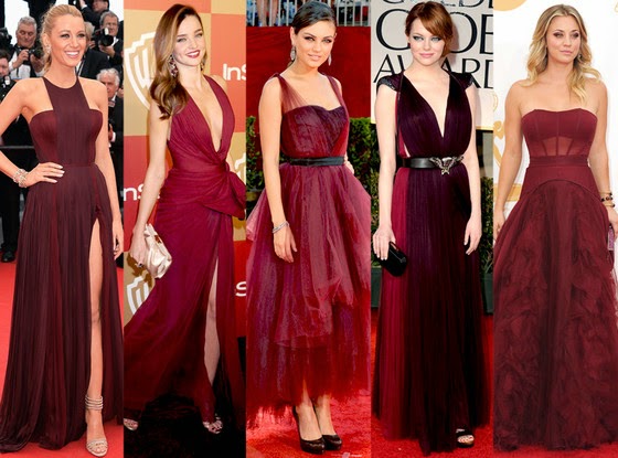
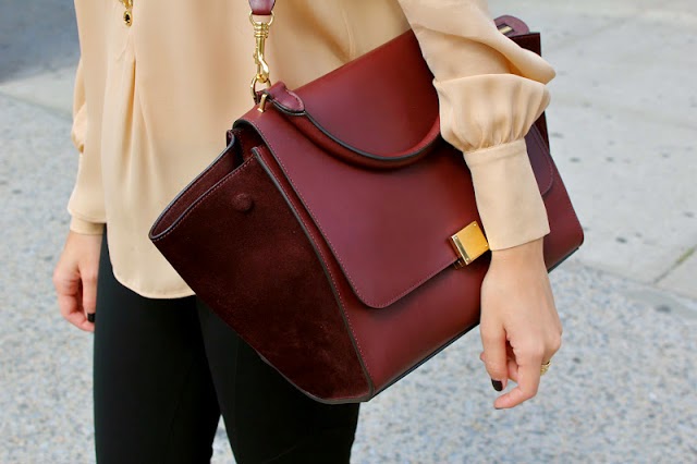
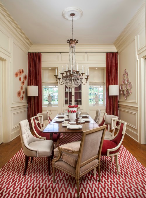
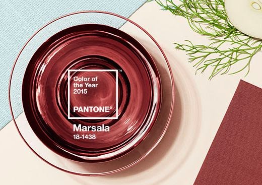
If you follow my Instagram, you will have noticed that I posted Pantone’s colour of the year, Marsala. Apparently, this colour has been causing quite a stir since it’s announcement. I found an article that explained people’s reactions to the colour, which seemed to lean on the negative side of what this colour evokes (click HERE). Personally, I like the colour. I am surprised I like it. Maybe it’s because I found last year’s colour, Radiant Orchid, too bright for me to apply to interior colour schemes. In the case of Marsala, I think it can be a complimentary colour and I may actually use it.
 |
| via |
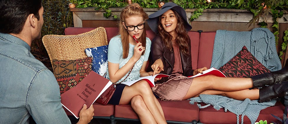
Pantone has expressed this colour to be grounding, earthly, luxurious and reminiscent of wine. I agree. I think that it is a classic colour; not a red, not a brown, but instead, a mixture of the two. I see rust, garnet and maroon in the colour, which I think can be paired well the ever so popular rustic-industrial look we keep seeing on Pinterest and magazines.
Marsala coincides with the popularity of gem stone colours. Remember, Emerald was reigned the “it” colour in 2013. We are still seeing these tones splashed on the runways and in stores. If the fashion world is still holding on to these tones, interiors will always tag along with them.
 |
| via |
